" height="16px" id="NccieQuU3" width="16px"/><path d="M 0.32 2.4 C 0.143 2.4 0 2.257 0 2.08 L 0 0.32 C 0 0.143 0.143 0 0.32 0 L 2.08 0 C 2.257 0 2.4 0.143 2.4 0.32 L 2.4 2.08 C 2.4 2.257 2.257 2.4 2.08 2.4 Z" fill="rgb(255, 255, 255)" height="2.4000000000000004px" id="IQcOADbmf" transform="translate(2.72 2.56)" width="2.4000000000000004px"/><path d="M 0 0.48 L 2.4 0.48 L 2.4 7.84 L 0 7.84 Z M 3.36 7.84 L 3.36 0.48 L 5.76 0.48 L 5.76 2.24 C 6.24 1.12 7.36 0 8.8 0 C 10.88 0 10.88 1.92 10.88 3.68 L 10.88 7.84 L 8.48 7.84 L 8.48 3.84 C 8.48 2.88 8.16 2.08 7.36 2.08 C 6.56 2.08 5.76 2.72 5.76 3.84 L 5.76 7.84 Z" fill="rgb(255, 255, 255)" height="7.840000466108322px" id="hEyY_ZE7j" transform="translate(2.72 5.44)" width="10.880000371932987px"/></g></svg>)
To respect my non-disclosure agreement, certain details in this case study have been simplified, modified, or omitted. This case study focuses on my design process, problem-solving approach, decision-making, and contributions, while ensuring that no confidential product information is disclosed.
From 4-Hours Manual Reports to a Real-Time Fleet Intelligence System
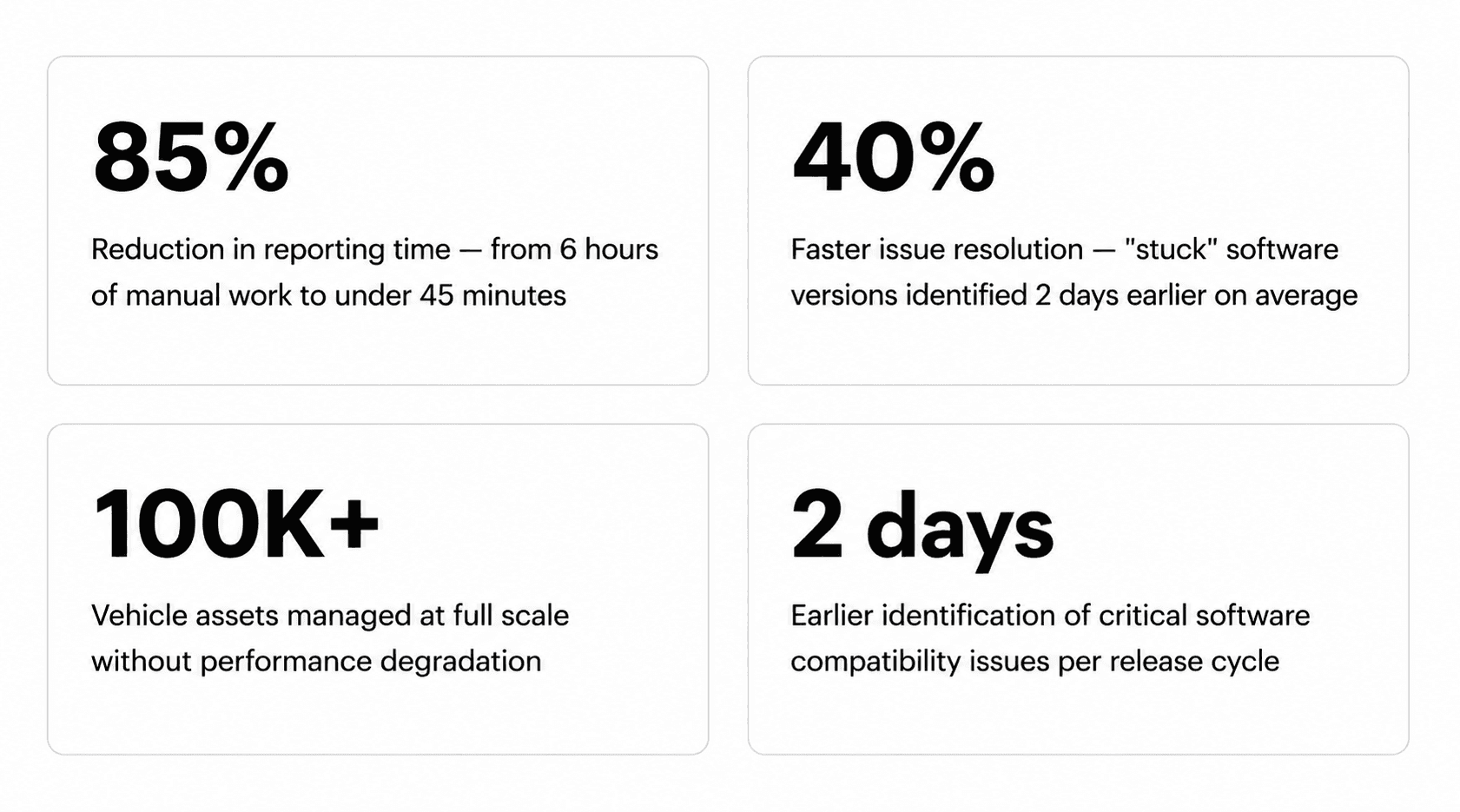
Renault manages tens of thousands of vehicles across production stages and software versions. I designed how their teams see, query, and act on that data - cutting reporting time by 85% and issue resolution time by 40%.
Client:
Renault Group
Domain:
Fleet Operations & Vehicle Intelligence
My Role:
Lead Product Designer
Platform:
Internal B2B Web App
Users:
Fleet Ops Managers, Release Engineers, Maintenance Leads
Overview
Most fleet tools answer one question: where is the vehicle? Fleet Tracker answers a harder one: what state is it in?
Renault's internal platform manages the full technical lifecycle of their vehicle fleet tracking production stages, software version distribution, and hardware-software compatibility across tens of thousands of assets. Think of it as a digital twin layer: not just location, but the live configuration state of every vehicle in the fleet.
My role was to design how that data was surfaced, moving teams from 4 hours manual reporting cycles to a real-time decision-support system.
Problem Statement
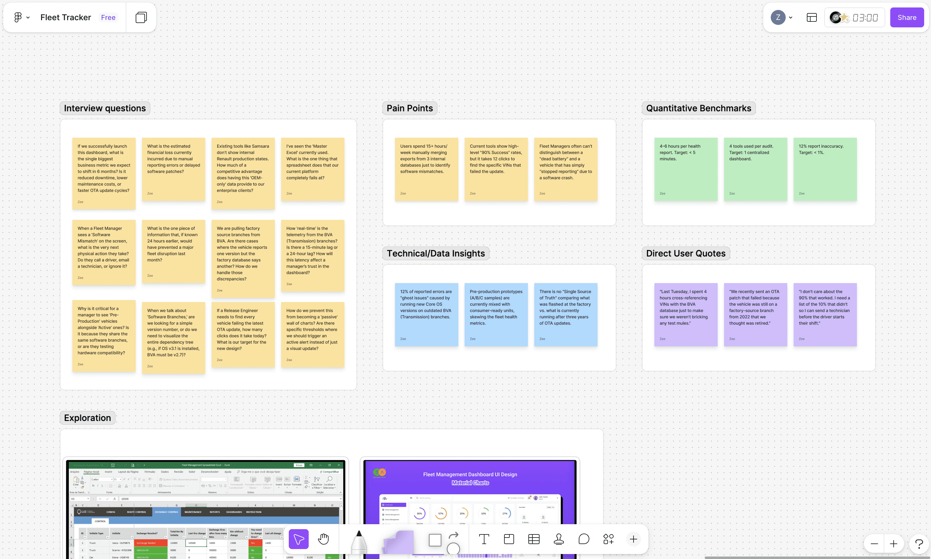
Answering a basic operational question "How many vehicles in Zone A are running outdated v2.4 software?" required a 2–3 hours process:
Export raw CSVs from three internal databases → pivot data in Excel to correlate production dates with software branches → manually cross-reference logs to distinguish pre-production from live units.
Every report was built from scratch. Every insight arrived hours after it was needed. And because the data lived in disconnected systems, there was no way to trust that what you were looking at was still accurate by the time you acted on it.
The real cost wasn't just time. Delayed software patches meant vehicles stayed on incompatible firmware longer. Mismatched hardware-software configurations caused avoidable field failures. And when critical issues emerged, fleet managers had no fast way to identify which vehicles were affected.
Design problem:
How do you make a 2-3 hours manual process feel like a less than 10 mins lookup without losing the depth that operations teams actually need?
Research & Insights
I ran a two-week discovery phase with fleet operations managers and release engineers across Renault's France and India teams, shadowing live reporting cycles, not just interviews. Watching a manager spend 45 minutes pivoting a spreadsheet to answer one question told me more than any survey could.
Three findings shaped everything that followed:
1. The tools weren't the problem. The model was.
Teams weren't failing because their spreadsheets were clunky they were failing because no single system owned the relationship between production stage and software version. The data model itself was the gap, not the interface.
2. Market leaders had the same blind spot.
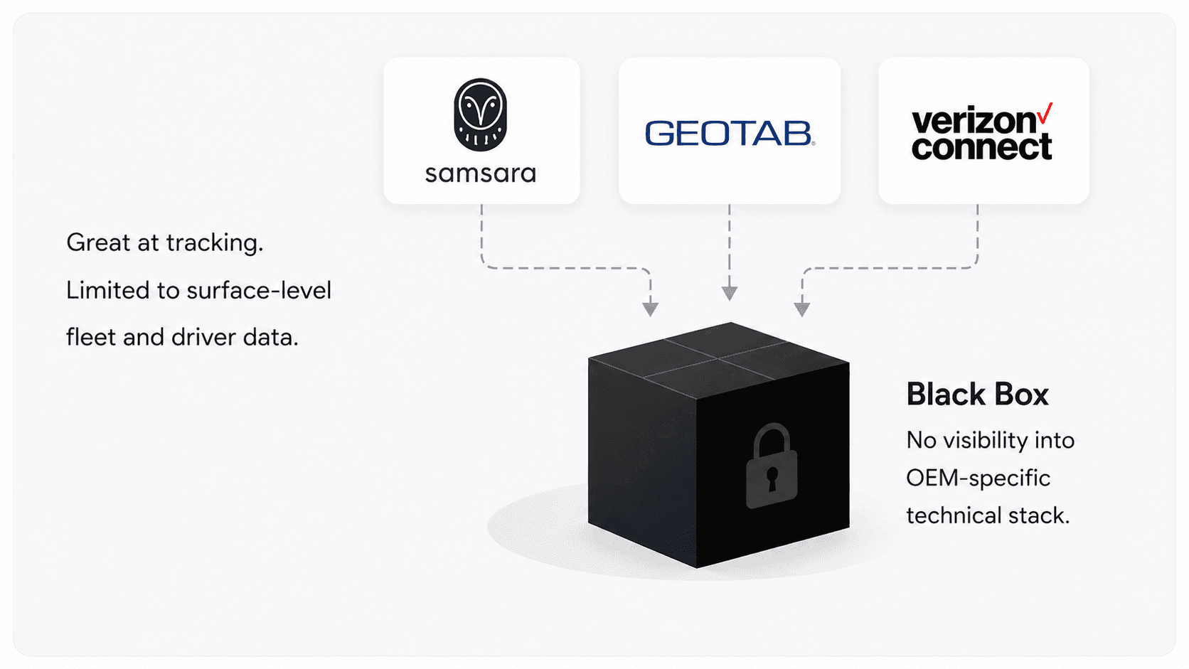
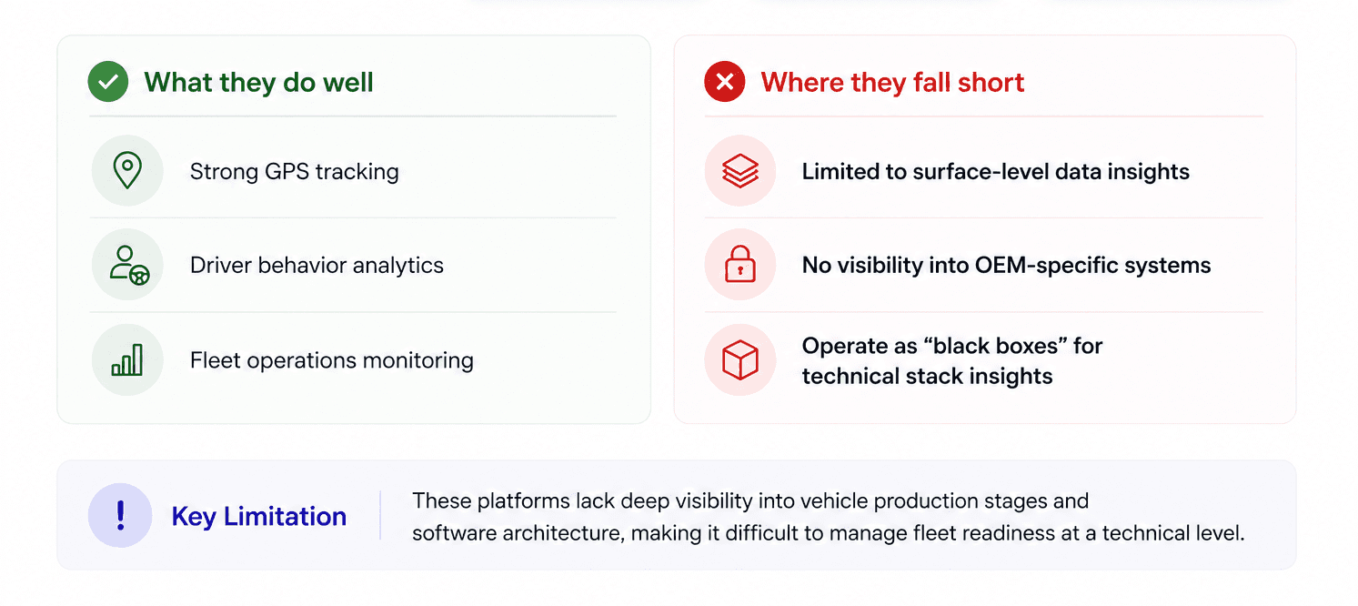
Samsara, Geotab, and Verizon Connect all operate as black boxes at the OEM level. They handle GPS and driver behavior well. They have no concept of firmware branching, production stage classification, or hardware-software compatibility. Fleet Tracker had a real opportunity to own this gap.
3. Trust in the data was already broken.
When I asked operations teams how confident they were in their reports, the answer was consistent: "It depends on when it was last updated." Data freshness wasn't just a UX problem , it was eroding the credibility of the entire reporting process.
Strategy & Approach
The strategic shift I proposed was simple to say and hard to execute: stop building a data display tool and start building a decision-support system.
Data display answers "what is the current state?" Decision support answers "what do I need to act on right now?" That distinction shaped every design decision, from how filters behave to how data freshness is communicated.
Four principles anchored the design:
Deviation-first hierarchy
Healthy data doesn't need attention. The interface should make problems impossible to miss and easy to dismiss once resolved, not treat all states equally.
Fleet → vehicle progressive disclosure
Every flow starts at the fleet level. Drilling into a specific issue should feel like zooming in, not starting over. Context never resets.
Filters that don't break flow
In the old process, filtering meant rebuilding the spreadsheet. Every filter in the new system updates the entire dashboard in real time, with visible state so users always know what they're looking at.
Honest data
A vehicle that hasn't reported in 72 hours isn't healthy, it's unknown. Surfacing that distinction explicitly, rather than omitting stale records, was a trust-building decision as much as a UX one.
The Solution
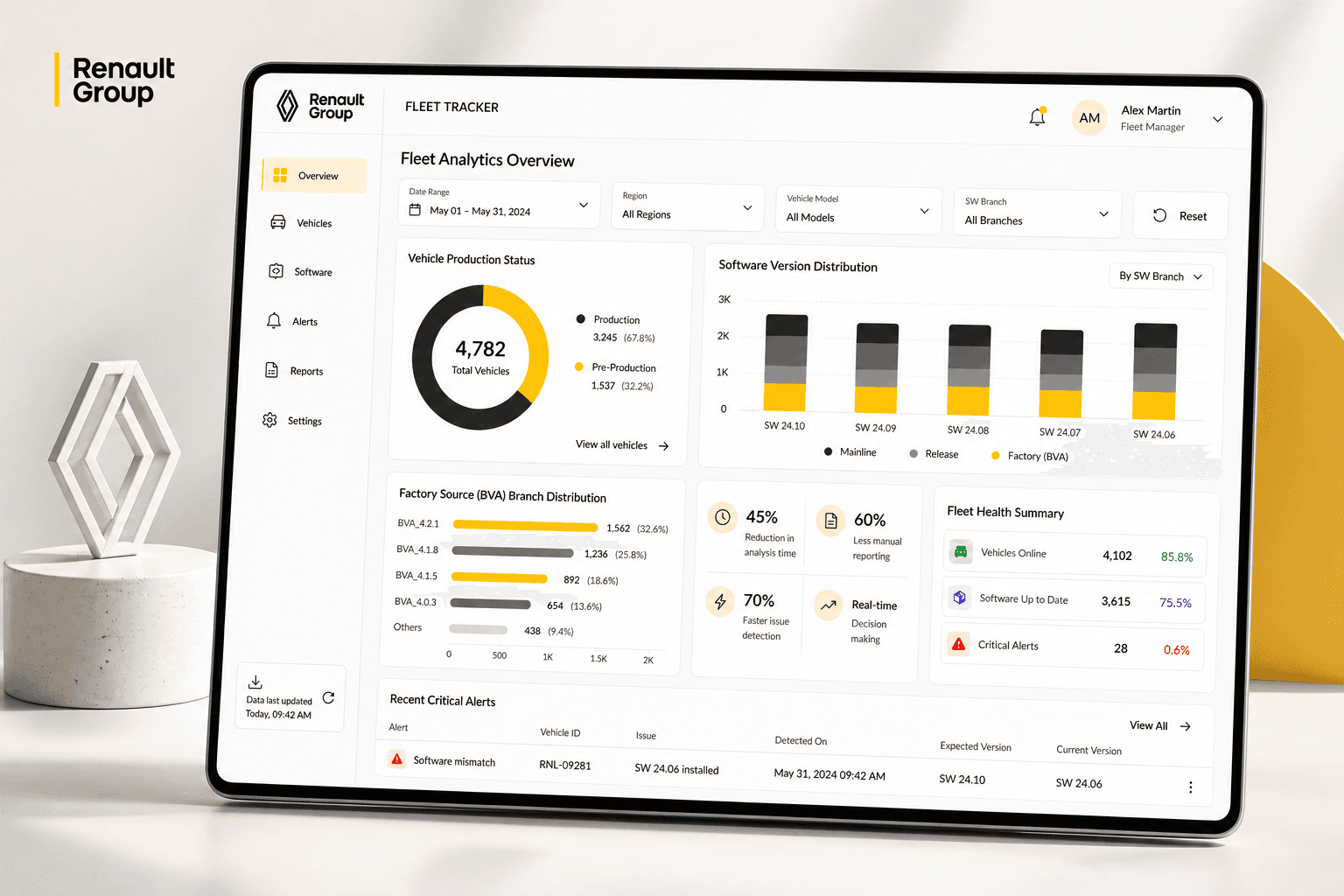
The Fleet Health Command Center
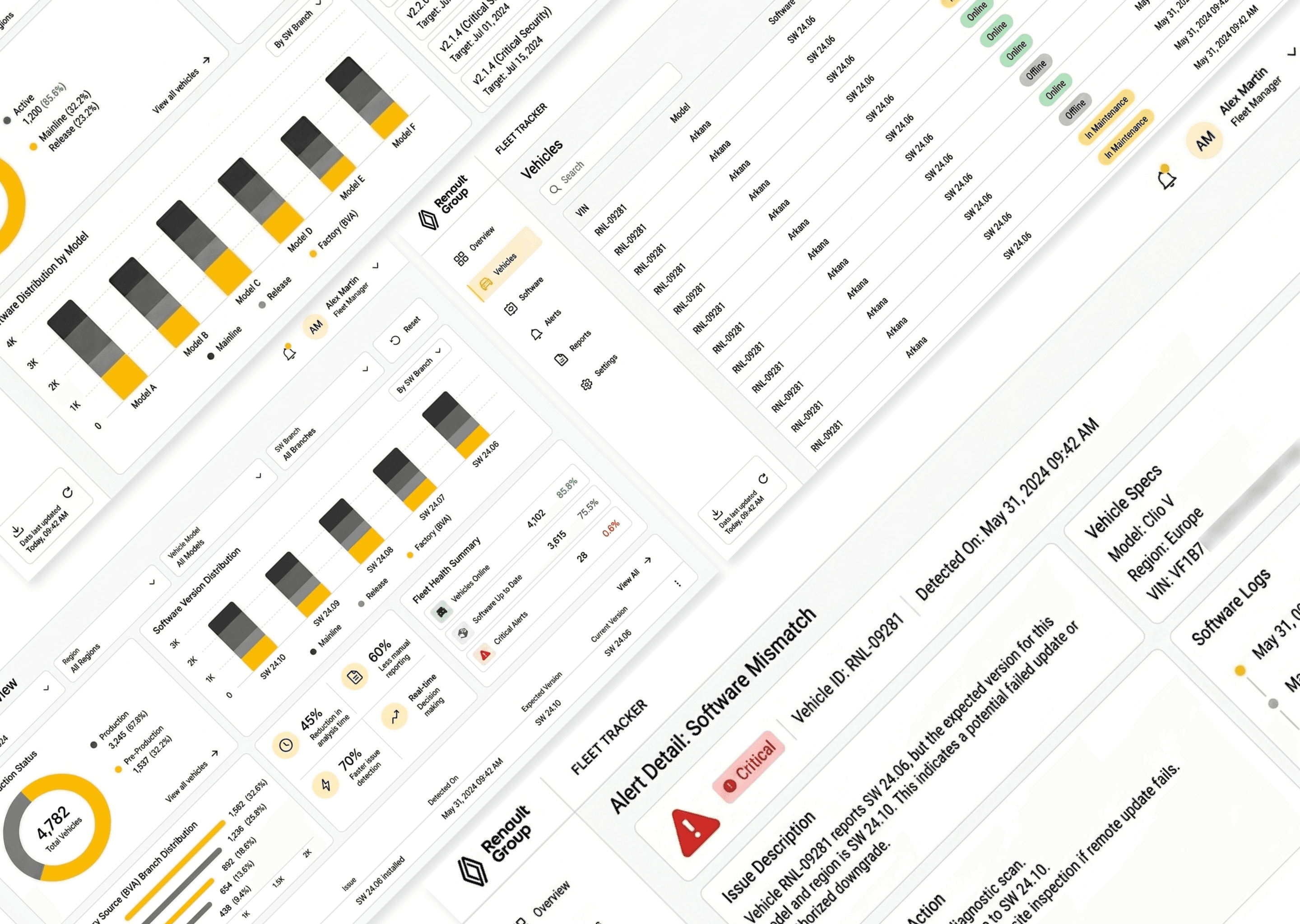
The dashboard is built around two interlocking modules: Production Lifecycle Tracker and Software Version Distribution. Together they answer the question that previously required three databases and an Excel session, what is the current technical state of the fleet, and where are the problems?
The layout is high-density by design. Fleet operations managers are not casual users, they're looking at this during active issues, under time pressure. Every pixel had to earn its place.
Global Filtering That Updates Everything
A persistent filter bar lets teams slice the entire dashboard simultaneously by VIN range, batch ID, geographical zone, or hardware revision. Every change propagates in real time. There's no "apply" button, no page reloads, no lost context. This was the single interaction teams responded to most strongly in walkthroughs, it directly replaced the Excel pivot habit.
Drill-Down to Action
Clicking a "Critical Outdated" segment doesn't just zoom in, it generates a pre-populated action list below the fold, showing the specific VINs, current location, and last contact time for those vehicles. The gap between "I see a problem" and "I know which vehicles to act on" went from hours to seconds.
Two Critical Edge Cases
→ Stale data: a vehicle offline for 72+ hours is flagged explicitly rather than being omitted. Removing it from the count would have created false positives in health reports, a trust problem, not just a display problem.
→ Scale: canvas rendering was used for visualizations at 100,000+ data point density, ensuring interactions remained responsive at full fleet scale.

AI-Augmented Design Workflow
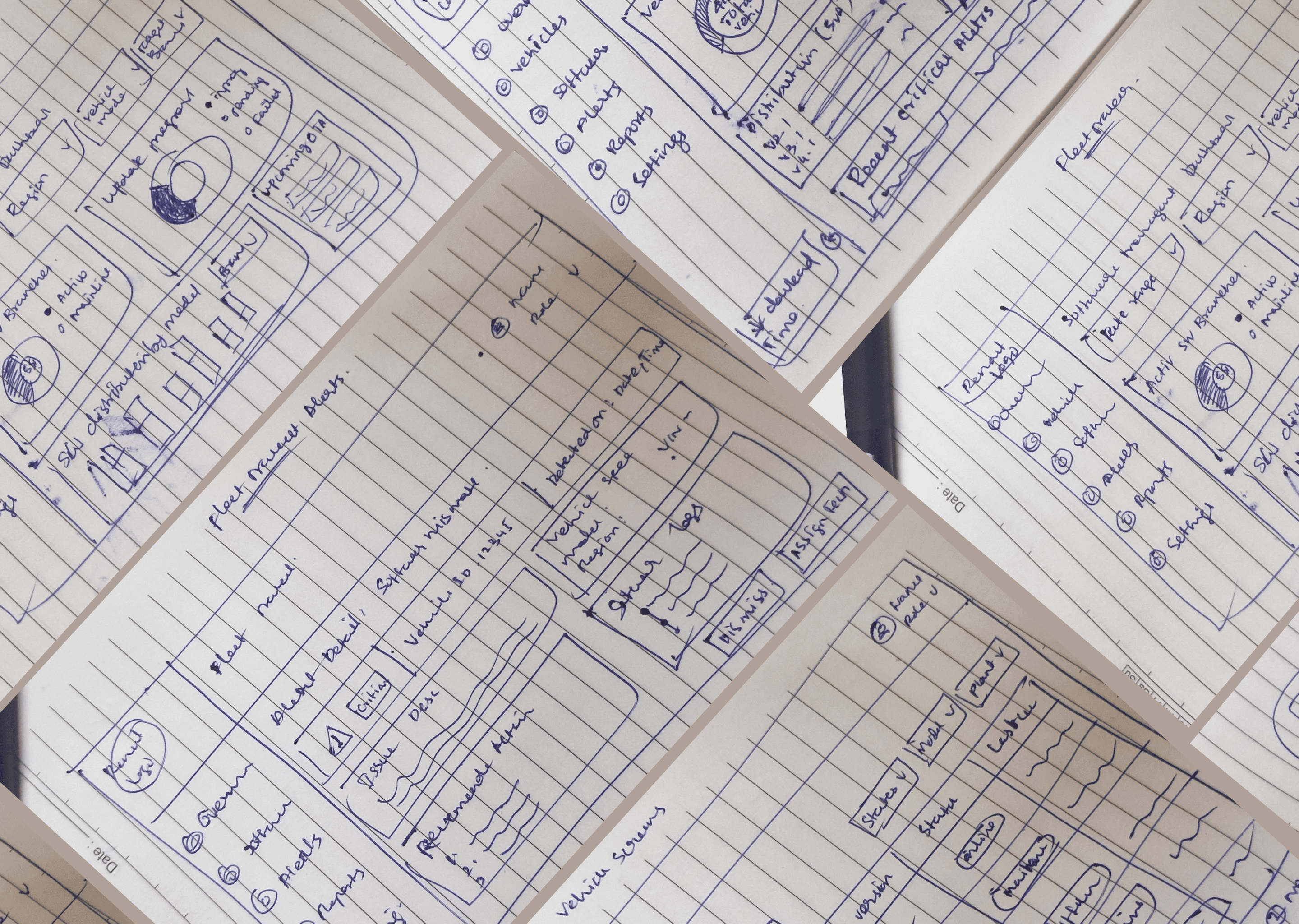
I used an AI-augmented workflow at the exploration stage, generating layout variations and data visualisation options faster than traditional sketching allowed. This compressed the ideation phase significantly and let me bring higher-fidelity concepts to stakeholder reviews earlier.
The value wasn't in the AI output itself, most of it needed significant refinement. The value was in the speed of the exploration loop: generate, evaluate, discard, iterate. What would have been a week of wireframing became two days of focused critique sessions.
All final decisions were grounded in product requirements, data schema constraints, and direct feedback from operations teams. The AI accelerated the path to the right idea; it didn't find it.

Impact & Metrics
Validated over two months with large-scale fleet operations teams across Renault.
Challenges & Design Decisions
The density problem.
High-information dashboards for expert users risk two failure modes: overwhelming novices and underwhelming experts. For fleet operations managers dealing with active issues, the right answer was to optimise for the expert, high density with progressive disclosure for depth, rather than simplification that would force extra clicks during time-critical workflows.
Filter states and empty results
When a filter combination returned zero results, early prototypes simply showed a blank state. Teams interpreted this as a system error. The fix was a two-part pattern: a clear "no results for this filter combination" message with the active filters displayed, plus a single-click reset. Trust in the filter logic recovered immediately.
Rendering at scale
Standard SVG rendering degraded noticeably above ~10,000 data points. Switching to Canvas rendering resolved this entirely at 100,000+ points but required close collaboration with engineering to validate feasibility before it was committed to the design.
Conflicting data sources
Vehicles reporting to multiple systems occasionally surfaced conflicting status states. Rather than resolving the conflict silently (and risking incorrect data), I introduced an explicit "data conflict" indicator that surfaced the discrepancy and prompted investigation. Operations teams said this was the most trust-building single addition in the product.

Key Learnings
The hardest part wasn't designing the system, it was earning trust from teams who had built workarounds they relied on. In enterprise environments, a broken release has real business cost. People protect their processes.
The lesson I carried forward: make the new system feel less risky than the old one. That meant involving PMO leads in architectural decisions, making rollback paths visible in the UI, and launching with a template library so teams could onboard without abandoning what was familiar.
If I could revisit one thing: I'd instrument adoption from week one which teams migrated, at what rate, where drop-offs happened. We had strong outcome metrics, but the adoption story was reconstructed after the fact. Better instrumentation would have made the case for scaling faster.
Other Case Studies